The anatomy of our kanban board
I previously wrote about the reasons my team is using kanban to organise our work. Here I go into further detail about how our board is set up and why.
Columns
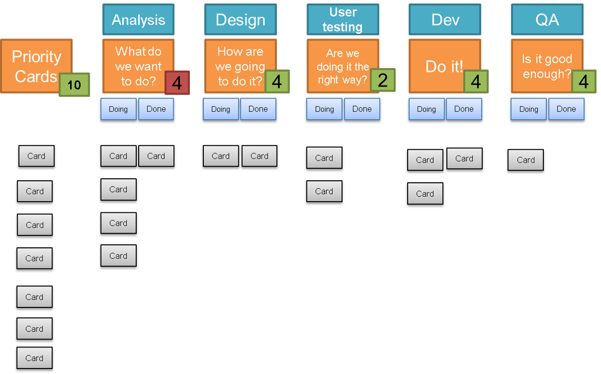
The columns on our kanban board are based on the workflow that our features take to delivery. We have descriptions under each of these headings to identify what we are expecting to happen at each of these stages — identify what it is we want to do, how we are going to do it, check if we are doing it the right way, doing it, and then is it good enough.
We promote sitting cards where the activity best fits based on those descriptions, and not focusing on the job role required to do it. If a developer is doing some technical analysis of the deployment pipeline, this should be in the analysis column and not the development column. User researchers should be working with business analysts early on to identify what hypotheses we have with new features and then to design their research rather than having a prototyped feature chucked over the wall for them to test. The number of columns and the column headings has been iterated a few times already and continue to be improved to best reflect our working practices.
In each column we have sub columns of in progress and done, so that we can indicate when a card can be picked up for the next stage.
 The current layout of my kanban board
The priority backlog
Whilst there are a number of cards in our backlog at any time, the product owner only selects at most 10 to be on the priority backlog list. Prioritising any more than 10 in advance is a waste of time. These are displayed to the left of the kanban board, and any new work that is picked up by a team member should come from this list. We typically aim to have two backend tasks on this list, with the rest being up to the product owner to choose as they wish. The product owner will order these in order of priority from top to bottom to indicate what they would like worked on first.
When picking up a new piece of work, each member of the team first checks if there is anything already on the board they could work on to move it further towards release. They should work from right to left, focusing first on the working closest to being released to avoid adding more started work and leaving other work unfinished.
Cards
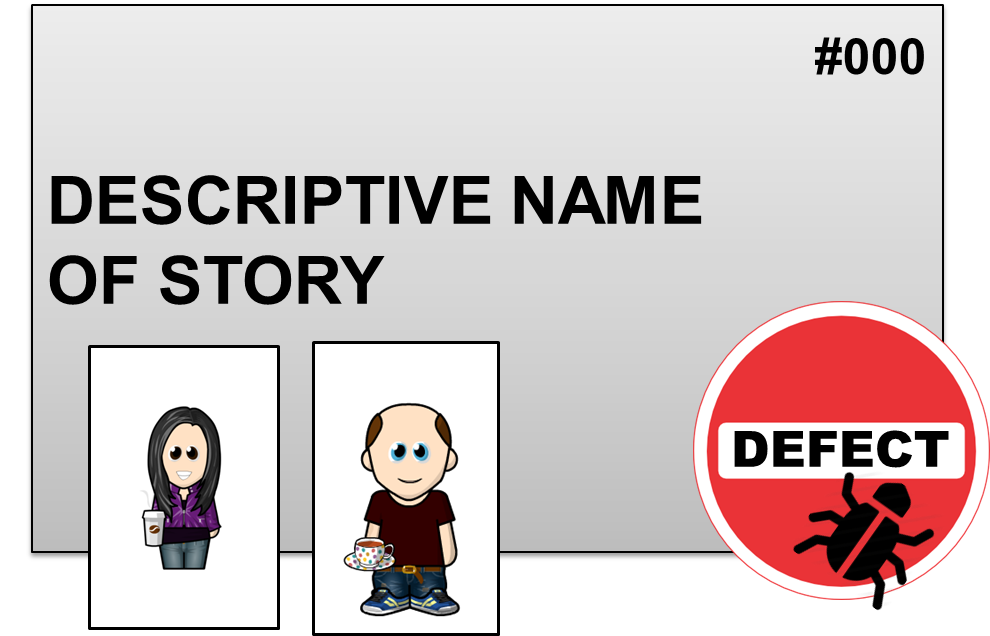
Each card is for a story, and we expect them to move through each column on the board. The card details the story title, and is just enough that everyone can get an understanding of what is involved if they read the board or attend stand-up. We do not need any of the detail about the card, as this is all held in jira. We include the number on the top right hand corner of the card so that we can easily find it in jira to get further detail. The information about who is working on the card, and if any blockers or defects on the card get stuck to it and will be covered later.
 The layout of a card on my board
Work in progress
We have work in progress (WIP) limits for each of the columns on the board. These ensure that we do not introduce internal queues for certain pieces of work to be completed, and focus the team on delivering completed features rather than mindlessly continuing to pick up more items to work on when other team members are overwhelmed. The work in progress limit applies to both the in progress and done work of a column, ensuring that work cannot pile up in ‘done’ waiting for someone to pick it up.
When a work in progress limit is breached, no more work can be started in that column, and team members wishing to do this work should do what they can to help reduce the queue.
The WIP limits were initially set as a guess based on the number of developers, and have been tweaked a little. Analysis had ended up with a slightly higher limit, to reflect the fact that some features get analysed and then rapidly closed if it turns out the work is not a priority, or that it could be delivered elsewhere. This has recently been reduced in line with the other columns.
We have some lovely green and red indicators to the top of each column to signal if the work in progress limit has been breached.
Avatars
We have avatars for each team members so that we can indicate who is working on each piece of work. This has the added benefit of quickly identifying any cards not being worked on by anyone.
The avatars are also used to limit work in progress further, by ensuring that not only are limits not breached within an area of work, but that each individual is not overwhelmed by work. As we have encouraged people to work across different delivery areas, having work in progress limits just on the work areas could still lead to individual team members being overworked across multiple different areas. This is not good for productivity or team health.
Each user has 2 avatars (recently reduced form 3), and is allowed to reduce this number at any time. They can also add more than one of their avatar to a piece of work if they feel that that is where their main focus lies. Some users have also reduced their number of available avatars by attaching them to ongoing jobs above the board, such as “end of year HR stuff” which wouldn’t necessarily be on the kanban board as this focuses on feature delivery. This also helps indicate what kinds of things are taking up the teams time.
Swim lanes
We have at some points had two swim lanes on our kanban board for work being done on similar projects that are being delivered to different customers. We started out having two separate boards for this, but due to the number of team members who had an input to both projects, and the dependencies between the two we have added them to the same board. This allowed us to keep track of the team capacity across both projects by having the work in progress limits cover both, ensure that we did not go over our capacity without realising it. It also allowed us to have flexible and sometimes uneven prioritisation of work across the two projects, and divert more resource to one project without having to adjust individual project WIP limits. We ended up merging the work into the same board when it became clear the swim lanes weren’t really adding anything.
Defects
We indicate when a defect has been identified with a feature using a defect sticker. This can be at any stage, but they typically appear in the user testing and quality assurance columns. These stickers allow us to do the work to fix the defect in the column where the defect was identified rather than moving the card back to the left to the column where the work needs to be done.
The reason for this is that we prioritise our work based on what is closest to release, and we identify this as being the cards nearest to the right hand side of the board. By moving the card to the left, we would in effect be deprioritising the card. In reality, the opposite needs to happen and the priority to fix the defect needs to come ahead of other work to be done in that earlier stage. For example, if a defect is identified in quality assurance, the fix for this in development should be prioritised ahead of working on other cards in development, and certainly ahead of picking up new cards for development from the done column of user testing.
Blockers
Similarly to the defects, we identify blockers with a sticker. We still discuss these cards in each standup, and focus on what needs to be done to remove the blocker. These cards are still included in work in progress limits, to ensure that the pressure is kept up to remove the blocker. We have started recording the reasons that blocker cards get added so that we can spot any trends developing, and address these in our retrospectives.
This set up has worked well for us in delivering and improving a service whilst rolling out to new sites, and will probably continue to work well for us as we move into live service and support. I am currently working on a layout that will work better for us with the initial discovery for a project, when we are still feeling out what our problem space is, and what our options might be. I’m sure once I have a better idea of what form it will take it will feature in a blog post. For now it has taken over a large wall and involves string.
